
랜딩 페이지란?
랜딩 페이지(landing page)는 검색 엔진, 광고 등을 경유하여 접속하는 이용자가 최초로 보게 되는 웹페이지이다.
링크를 클릭하고 해당 웹페이지에 접속하면 마케터가 의도한 행위를 하도록 하는 페이지를 의미한다.
현재 진행하고있는 창업아이탬 GGOOMING 의 랜딩페이지를 제작하기 위해 이 프로젝트를 시작했다.
GGOOMING 은 중고등학생의 자아인식을 도와주는 에듀테크 웹 플렛폼이다.
사실 랜딩페이지라는것은 개발자 하나만 있어서 만들어질 수 있는게 아니다.
정말 '랜딩페이지' 의 효과를 보고싶다면 우리는 랜딩페이지에 사람들을 끌어모을 수 있는 마케터, 유저의 관심을 끌어줄 UI UX 디자이너, 그리고 개발자가 필요하다.
좀 더 세분화하자면
개발자에도 '프론트엔드'와 '백엔드' 개발자가 필요한데,
프론트엔드는 눈에 보이는 웹사이트의 모양을, 백엔드는 웹사이트를 사람들에게 보이도록 서버를 잡아주는 역할을 한다.
이 글은 프론트엔드 개발자 지망생으로써의 랜딩페이지 제작기이다.
1. 기존 랜딩페이지 분석
제작하기 전, 기존 랜딩페이지들을 html 구조적 관점으로 분석해서 가장 보편적인 디자인을 선택할 것이다.
우리가 개발하고자하는 GGOOMING은 웹 플랫폼이기에, 다른 웹 어플리케이션들이 어떤 방식으로 앤딩페이지를 제작하였는지 분석해볼 것이다.
요즘 tech 기반 유니콘 기업들이 많다.
한국에는 23개의 유니콘 기업들이 있는데, 이중 tech 기반 기업들의 랜딩페이지를 분석해보자.
https://docs.google.com/spreadsheets/d/1kgtRAZQYZh5iIjf-FzfkiOXCY_5T0EkcASX_dyx2Dds/edit#gid=0
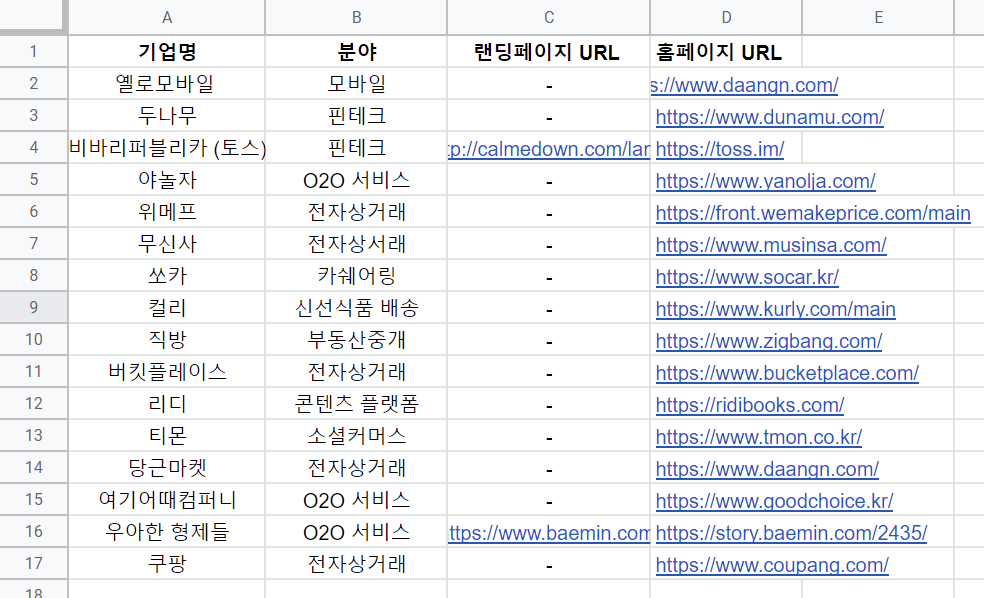
랜딩페이지가 홈페이지의 첫 페이지에 있는 경우가 많았다.
딱 한장짜리 랜딩페이지는 토스와 배달의민족 뿐이였다.
다른 기업들도 분석해 보았더니 (스프레드시트 참조) 대표적인 랜딩페이지의 구조는 다음과 같았다.
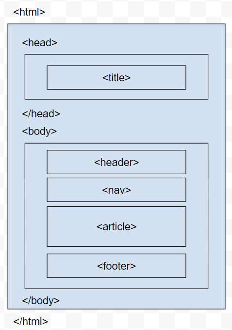
이 구조에서 article 부분이 여러번 반복된 형태를 지니고 있었다.
2. 랜딩페이지 HTML구조 제작과정
분석한 랜딩페이지의 구조는 Web application 강의에서 과제로 만들었던 내 광기의 웹사이트와 매우 유사했다.
내 웹사이트 또한 <nav> 요소가 상단에 가로로 자리잡고 있었고,
href="#~" 을 사용해서 클릭할 시 한 페이지에서 다른 section 으로 이동할 수 있게 만들어져 있었다.
이 웹사이트를 만들때 나는 깔끔함을 그다지 신경쓰지 않았기에, 코드가 다소 난잡했다.

웹페이지의 html 코드:
더보기
<!DOCTYPE html>
<html lang="en"><head>
<link rel="shortcut icon" href="picture/1.jpg">
<title>
Emily's Website
</title>
<meta name="viewport" content="width=device-width, initial-scale=1.0">
<link href="https://cdn.jsdelivr.net/npm/bootstrap@5.1.3/dist/css/bootstrap.min.css" rel="stylesheet" integrity="sha384- 1BmE4kWBq78iYhFldvKuhfTAU6auU8tT94WrHftjDbrCEXSU1oBoqyl2QvZ6jIW3" crossorigin="anonymous">
<link rel="preconnect" href="https://fonts.googleapis.com">
<link rel="stylesheet" href="dark.css" media="(prefers-color-scheme: dark)" />
<link rel="stylesheet" href="style.css" media="(prefers-color-scheme: light)"/>
<link rel="preconnect" href="https://fonts.gstatic.com" crossorigin>
<link href="https://fonts.googleapis.com/css2?family=Gloria+Hallelujah&family=Mochiy+Pop+P+One&display=swap" rel="stylesheet">
<script src="action.js"></script>
<script src="https://code.jquery.com/jquery-3.3.1.slim.min.js" integrity="sha384-q8i/X+965DzO0rT7abK41JStQIAqVgRVzpbzo5smXKp4YfRvH+8abtTE1Pi6jizo" crossorigin="anonymous"></script>
<script src="https://cdn.jsdelivr.net/npm/popper.js@1.14.7/dist/umd/popper.min.js" integrity="sha384-UO2eT0CpHqdSJQ6hJty5KVphtPhzWj9WO1clHTMGa3JDZwrnQq4sF86dIHNDz0W1" crossorigin="anonymous"></script>
<script src="https://cdn.jsdelivr.net/npm/bootstrap@4.3.1/dist/js/bootstrap.min.js" integrity="sha384-JjSmVgyd0p3pXB1rRibZUAYoIIy6OrQ6VrjIEaFf/nJGzIxFDsf4x0xIM+B07jRM" crossorigin="anonymous"></script>
</head>
<body onload="loadfile()">
<article>
<header class="container" id="befhover" >
<div class="headertext">
<h1>I'm <span>Juhee Hur</span></h1>
<h4>Broad-based engineering year 1 student</h4>
</div>
</header>
<nav class="navbar" >
<ul id="navigation">
<li><a href="#about">About</a></li>
<li><a href="#courses">Courses</a></li>
<li><a href="#links">Links</a></li>
<li><a onclick="special()">Special!</a></li>
<li><a href="#links">Comment</a></li>
</ul>
<div class="burger" onclick="menuclick()">
<div class="line1"></div>
<div class="line2"></div>
<div class="line3"></div>
</div>
<div class="btn-group" id="special">
<button onclick="align()" style="width:33.3%">Align</button>
<button onclick="newhobby()" style="width:33.3%">New Hobby</button>
<button onclick="scrollhide()" style="width:33.3%">Scroll</button>
</div>
</nav>
<div class="sticky">
<div class="progress-container" id="progressbar">
<div class="progress-bar" id="myBar"></div>
</div>
</div>
<section id="about">
<h2 id="header">All About Me</h2>
<p>
<picture>
<div class="crop">
<div id="bigscreen">
<img style="width: 250px; height: 250px; object-fit: cover;" src="picture/Juheehur.jpg">
<img style="width: 250px; height: 250px; object-fit: cover;" src="picture/hk.jpg">
<img style="width: 250px; height: 250px; object-fit: cover;" src="picture/hongkong.jpg">
<img style="width: 250px; height: 250px; object-fit: cover;" src="picture/world.jpg">
</div>
<div class="w3-content w3-display-container" id="slideshow" >
<img class="mySlides" style="width: 250px; height: 250px; object-fit: cover;" src="picture/Juheehur.jpg" >
<img class="mySlides" style="width: 250px; height: 250px; object-fit: cover;"src="picture/hk.jpg" >
<img class="mySlides" style="width: 250px; height: 250px; object-fit: cover;"src="picture/hongkong.jpg" >
<img class="mySlides" style="width: 250px; height: 250px; object-fit: cover;"src="picture/world.jpg">
<button class="w3-button w3-black w3-display-left" onclick="plusDivs(-1)">❮</button>
<button class="w3-button w3-black w3-display-right" onclick="plusDivs(1)">❯</button>
</div>
</div>
</picture>
Hi I am Juhee Hur Student from Broad-based engineering at CUHK. I love studying languages (both real and programming) and aiming for computer science!
</p>
<h3 id="header">My hobbies</h3>
<div id="hobbies" class="flex-container">
<div>Chess</div>
<div>Sudoku</div>
<div>Game</div>
</div>
</section>
<section id="courses">
<h2 id="header">My Courses</h2>
<table>
<tbody><tr>
<th>Course code</th>
<th>Contents</th>
<th>Credits</th>
</tr>
<tr>
<td>PHED1180</td>
<td>Badminton</td>
<td>1</td>
</tr>
<tr>
<td>ESTR2160</td>
<td>Building Web Applications</td>
<td>3</td>
</tr>
<tr>
<td>CLCP1133</td>
<td>Communication in Context I</td>
<td>3</td>
</tr>
<tr>
<td>CSCI1030</td>
<td>Hands-ono Introduction to JAVA</td>
<td>1</td>
</tr>
<tr>
<td>ENGG1120</td>
<td>Linear Algebra for Engineers</td>
<td>3</td>
</tr>
<tr>
<td>ENGG1130</td>
<td>Multivariable Calculus for Engineers</td>
<td>3</td>
</tr>
<tr>
<td>SPAN1000</td>
<td>Spanish I</td>
<td>3</td>
</tr>
</tbody></table>
</section>
<section id="links">
<h2 id="header">Interesting Links</h2>
<ul>
<li><a href="https://www.instagram.com/diatomic_carbon/" target="_blank">My instagram</a></li>
<li><a href="https://diatomicc.tistory.com/" target="_blank">Programming learning website</a></li>
<li><a href="https://comic.naver.com/artistTitle?artistId=319591" target="_blank">My comics</a></li>
<li><a href="https://ogqmarket.naver.com/creators/%ED%83%84%EC%86%8C" target="_blank">My sticker market</a></li>
</ul>
</section>
<section id="response">
<h2 id="header">Response Web Design</h2>
<ul>
<p>These are the following changes when you look with your mobile screens</p>
<li>Different form of navigation bar (horizontal for laptop and vertical for mobile)</li>
<li>Adjusted length of special button bar</li>
<li>mobile screen shows slideshow of pictures</li>
<li>mobile screen shows all text aligned in the center</li>
</ul>
</section>
<!--choose colour-->
<section id="comment">
<div class="choosecolor">
<h2 id="header">Choose your colour  </h2>
<div class="form-check">
<input class="form-check-input" type="radio" name="new-color" id="new-color-red" value="red">
<label class="form-check-label" for="new-color-red">Red</label>
</div>
<div class="form-check">
<input class="form-check-input" type="radio" name="new-color" id="new-color-green" value="green">
<label class="form-check-label" for="new-color-green">Green</label>
</div>
<div class="form-check">
<input class="form-check-input" type="radio" name="new-color" id="new-color-yellow" value="yellow">
<label class="form-check-label" for="new-color-yellow">Yellow</label>
</div>
<div class="form-check">
<input class="form-check-input" type="radio" name="new-color" id="new-color-blue" value="blue">
<label class="form-check-label" for="new-color-blue">Blue</label>
</div>
</div>
<form name="commentform">
<div class="container">
<div class="mb-3">
<label for="new-email" class="form-label">Email address</label>
<input type="email" class="form-control" id="new-email" placeholder="name@example.com">
</div>
<div class="mb-3">
<label for="new-comment" class="form-label" placeholder="write your comments here">Comment</label>
<textarea class="form-control" id="new-comment" rows="3"></textarea>
</div>
<button type="button" onclick="processform()">Add comment</button>
<div id="comments"class="box">
<div id="c1001" class="d-flex">
</div>
</div>
</div>
</form>
</section>
<footer>
This website was updated on <time>2022-02-27</time>. <b>© Juhee Hur</b>
</footer>
</article>
</body></html>>
내가 만드려는 GGOOMING 랜딩페이지의 취지와 맞게 html 구조를 정리했다.
<nav> 요소 밑에 <article> 을 쓸까 <section> 을 쓸까 고민하다가 <section>으로 나누고, 그 안에 필요하다면 <article> 을 쓰기로 했다.
<article> 과 <seciton> 요소의 차이:
https://diatomicc.tistory.com/71
HTML Article 과 Section의 차이
랜딩페이지를 제작하기 위해서 HTML 구조를 잡다가 문득 Article 과 Section중 무엇을 선택해야 할까 의문이 들었다. 두 태그 모두 HTML 5의 시맨틱 태그이다. 과 태그는 출력에 변경 사항이 없기 때문
diatomicc.tistory.com
2. 랜딩페이지 HTML구조 완성
<!DOCTYPE html>
<html>
	<head>
    <title>
        GGOOMING
    </title>
</head>

<body>

	<header>
	</header>

	<nav class="navbar" >
		<ul id="navigation">
			<li><a href="#about">About</a></li>
			<li><a href="#product">Product</a></li>
			<li><a href="#insight">Insight</a></li>
			<li><a href="#team">Team</a></li>
			<li><a href="#contact">Contact</a></li>
		</ul>
	</nav>


	<section id="about">
	</section>

	<section id="product">
	</section>

	<section id="insight">
	</section>

	<section id="team">
	</section>

	<section id="contact">
	</section>

	<footer>
	</footer>

</body>
</html>>


